Pollo Campero
Brand Identity +
Retail Design
Pollo Campero is a Central American fast food chain, specializing in fried chicken. Think KFC with a Latin twist that doesn’t make you need a nap after lunch. They found that customers in their growth markets, like Asia and Spain, didn’t connect with their current logo or restaurant concept as well as their core audience does.
The logo option shown above makes a big enough departure to signal the kind of change Campero is looking to make while evolving a few elements of the current logo, while below are some of my favorite variations that didn’t make the cut.


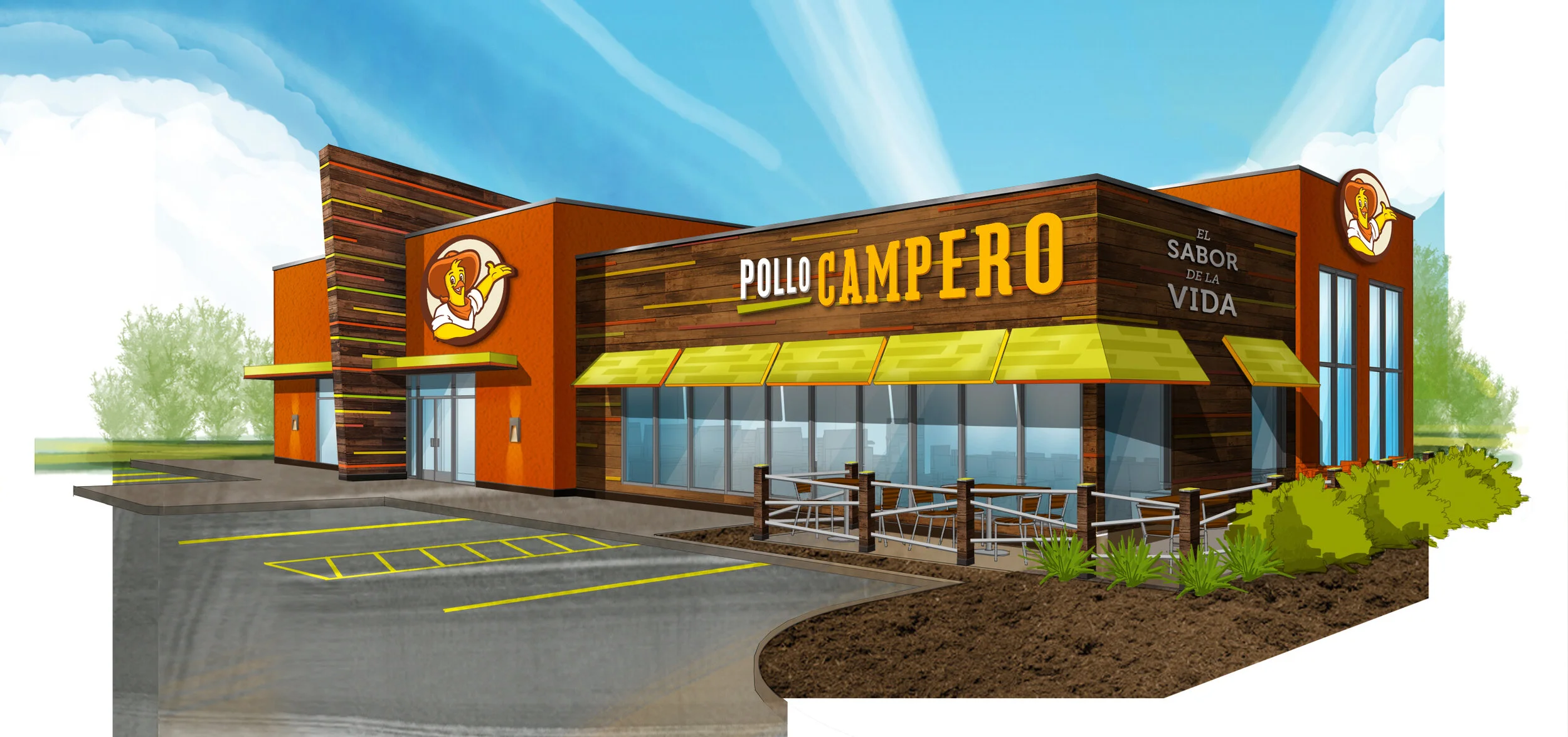
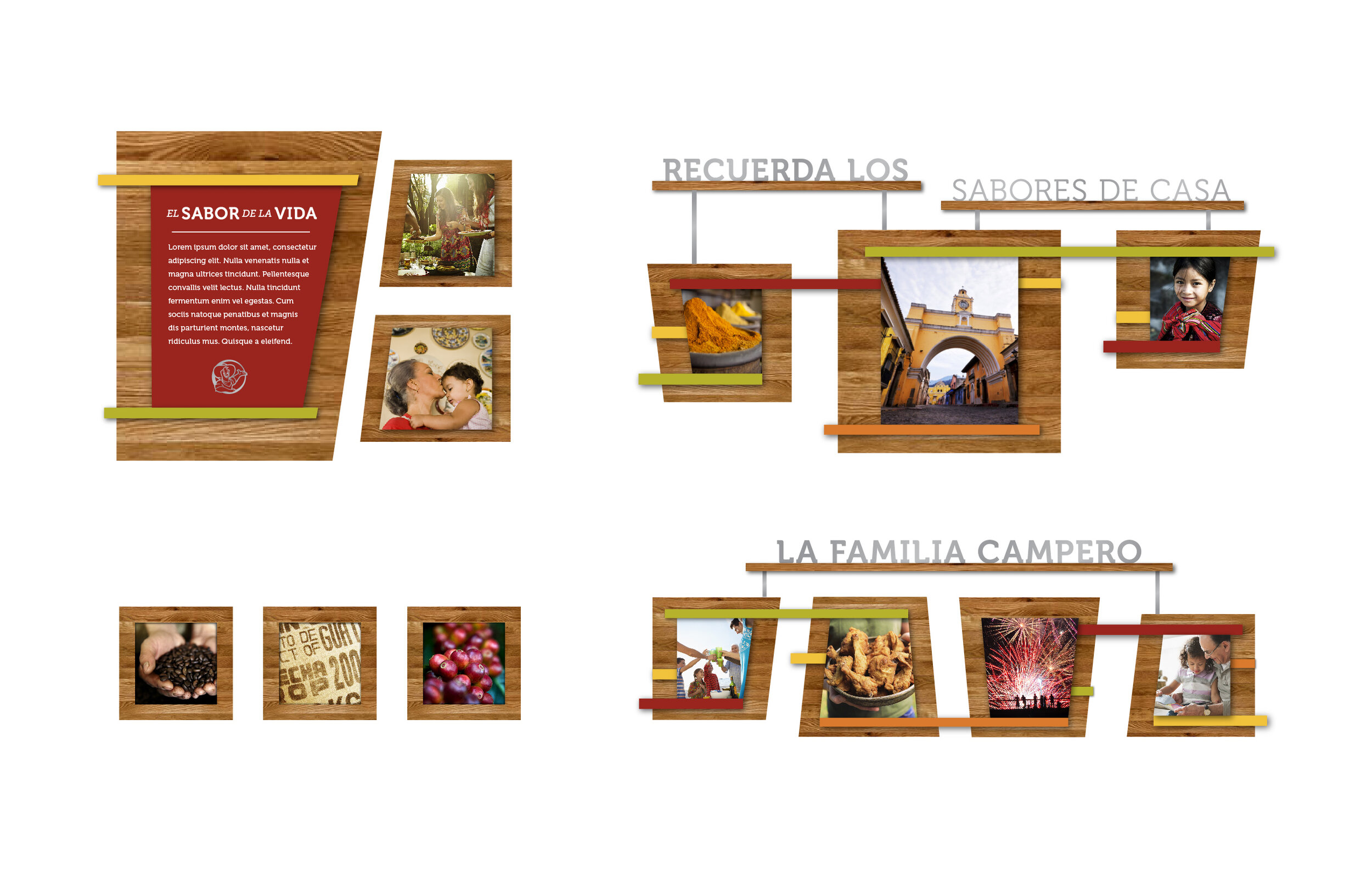
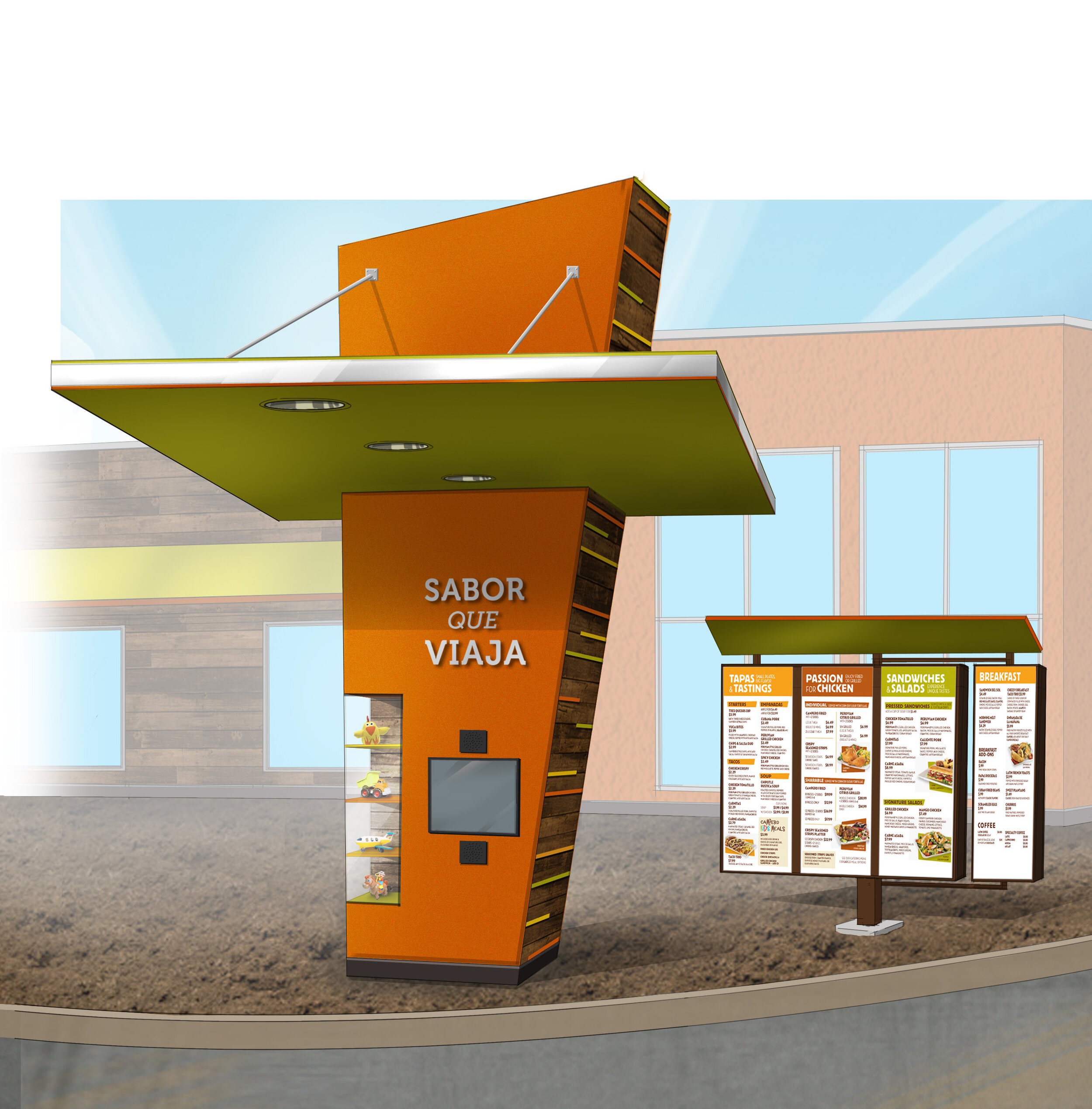
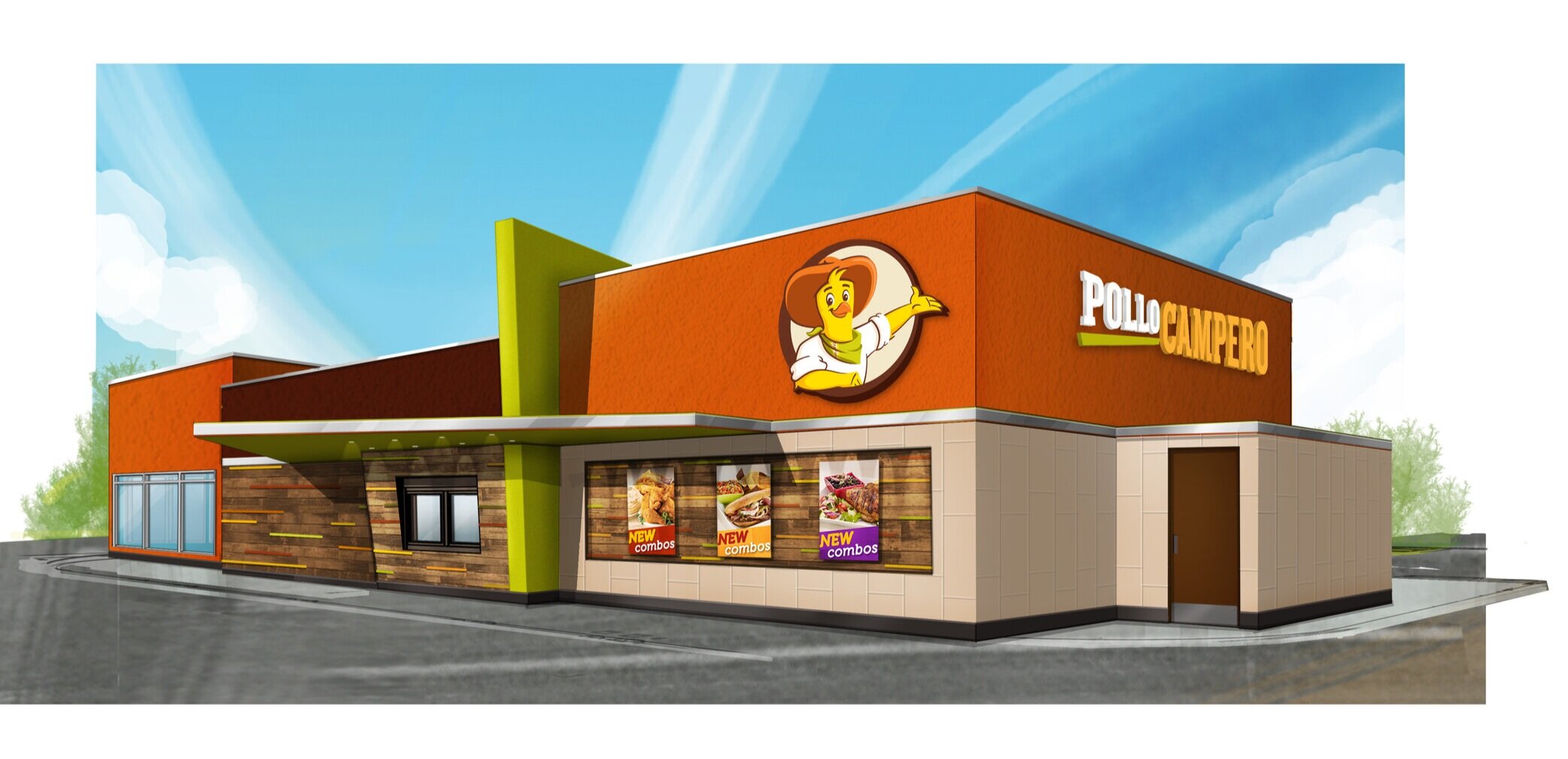
The new restaurant prototype has graphics that build on Pollo Campero’s heritage as an iconic Central American brand. The system is modular and can easily be made to fit any space, from food courts to flagships.